
We have selected various fonts which we could use in the credits during the opening of our thriller film, which we have sampled with the name of our production company. Most of the fonts which we have considered, including 'Break It', are bold sans serif fonts. This is common in British thriller films, such as 'The Disappearance of Alice Creed' and 'Essex Boys'. This could be because the broad fonts may connote brutality. Additionally, 'Break It' has a fractured appearance which creates suitable generic connotations of conflict and violence.

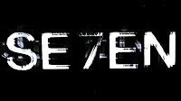
 Another font which we have considered is 'RR Ruitjes'. This sans serif font has a cage-like grid pattern which could foreshadow the capture of our protagonist. It also has a slightly worn look which connotes decay and despair. The damaged appearance could be compared to the scratchy font used in 'Se7en', which is effective because it is slightly unsettling for the audience.
 Additionally, we have considered 'Tox Typewriter' as a font to use within our credits. This is a typewriter-style line serif font, like the font which was used in 'Lock, Stock and Two Smoking Barrels'. The uneven widths of the letters' spines in 'Tox Typewriter' could be effective because it is suggestive of the themes of chaos and disorder which are common in thriller films.
No comments:
Post a Comment